Friday, November 13, 2009

Steve Hayden's NDAC Talk


Last night I saw Steve Hayden, an advertising giant (Chief Creative Officer, Ogilvy & Mather North America), speak in Denver at the Curtis Hotel for the New Denver Ad Club. I won't try to regurgitate all the relevant thoughts he surfaced, but I will mention what I walked away with.

Steve said if you simply add the letter "L" to the idea of an ad campaign - you have an "ideaL." His recent success has been marked by the ability to define the purpose of an ad with a noble or humorous statement like, "The world would be a better place if _____ did _____."

The best example I saw in his many commercials was the "Real Women" Dove campaign. With a noble purpose attached to a generic product, consumers became evangelists of the campaign and it spread like wildfire. I forget the actual line, but it was something like "The world would be a better place if the Dove Real Women campaign helped women feel beautiful about themselves."

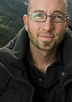
Thank you Steve Miller of NetNewsDesk.com for asking me to shot some snapshots of the talk. Hayden was a real gentleman. I took a quick portrait, above, on a deck outside the conference room.


Tuesday, November 3, 2009

Project Veronica


Here's a sneak peak at a series called Project Veronica that we just rolled out for a sound company called Blorp Corp, "a sonic laboratory specializing in custom and library music solutions for TV, film, and advertising." The premise was for Matt Hubball of Crispin Porter Bogusky and Evan Pollock to be creepy retro scientists constructing the perfect virtual cyborgenic receptionist who will actually answer the phones at Borp Corp.

When Matt Chiabotti of Cactus Communications described the project, I was into it 100%! I love it when clients have conceptual work that involves heavy retouching and compositing. If you have any work like this, please call me. I love it!

The above "assembly" shot was created from about 6 images. The big doors are huge 12' tall metal bi-fold doors that were used in a paint booth when my studio was a car garage. When we remodeled, we took down the doors and had them sandblasted. The doors separate the studio kitchen from the back studio space. I did all the retouching on these images, but Matt Chiabotti put the perfect final touch on this shot by adding the wires sticking out of the arm.

The above "power up" image was really fun to create. This image was made from 3 images. The wooden speakers on the left were duplicated and flipped to create a beefier stand for Evan's sound board. The electricity was created in Photoshop. The chair is a 1920's optometrist chair that Evan and Matt secured just for this shoot. I wish I could keep it for the studio makeup chair! It fit the creepy green theme perfectly.

And here you have the final "receptionist" image. The background is from a firefighter's museum. I remembered seeing it about a year ago during a scouting search. It worked perfectly for Veronica's office. The wall was plain and white, I had a good time staining it up in post. This is one of my favorite images to date.

Art Director: Matt Chiabotti
Stylist: Katelyn Simkins

Update!
I've received several emails from peers asking to show some of the original images to show before and after retouching. So, I'm taking town the curtain to show you some before pictures. I grabbed approximate images used... these may not be the exact images selected for final output.

After a pre-production meeting with the art director and Blorp Corp, I sketched out the shots to help me visualize the composition and lighting.


We only had the model for a limited time, so we had to shoot a lot quickly to get the look we wanted. We started with the "nicest" hair style since we would tear up the hair after the hero shot.
We all agreed that the above image had the robotic feel we were going for.

Above, you can see that the image was off balance with the wood speaker on one side.

Above is a direction I was exploring that used a full body mannequin, but Matt's stellar art direction steered me toward the floating head below. We felt that showing less was more.

Above is the floating mannequin head.

Here is our model who provided the face and arm for the Assembly shot.

We shot the above picture to get the flame and reflections from the flame. I ended up shooting the flame again on a grey background at 1/8000 of a second to freeze the flame and give it good color.

Crew shot below.

Wine and Dinner Party

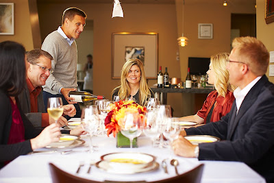
Hot off the press, 5280 Magazine just published a spread of my photos from a Dinner party we shot in back in June. The editors did a great job laying out the spread and picking just the right imagery to tell the story. We also did our best to let the dinner party "happen" to make it feel natural.

Frasca's Bobby Stuckey poured the wine from Jason Huntley's Washington Waters Winery. This is some seriously tasty wine people! I'm saving a S.W.A.G. bottle for the Thanksgiving holidays! Get some!


Technical Notes: We shot in an 11th story loft downtown Denver that has some amazing natural light. For this shoot, I brought a 4x4' shiny board and several plastic mirrors with Matthews frames and bounced them off the white ceiling from a balcony outside.


Photo Editor: Steffanie Woodward
Art Director: Alese Pickering Becket
Writer: Amanda M. Faison

Special Olympics and Denver Bronco Heroes


I had the honor of photographing some incredible Special Olympics kids with some genuine Denver Bronco's players in August. The Billboards have been strategically popping up right next to Invesco Field.

I was really thrilled that the three Denver Broncos were true gentlemen. On AND off camera alike, they were playing with the kids around the studio. I can report from the other side of the camera that this was more than just a photo-opp for these guys.

In addition, I'm lucky to get 15 minutes with a Bronco when I shoot for Sports Illustrated, but these guys hung out for hours laughing and boosting the egos of the kids. I truly believe all the kids left the studio beaming and feeling like a hero.


Broncos: DJ Williams, Andra Davis, and Darrell Reid

Agency: Pure
Creative Director: Gregg Bergan
Art Director: Jerry Stafford
Account Exec: Eric Espinoza

Volunteers of America


Here is a billboard campaign I photographed for Volunteers of America recently. I've seen a few of these around Denver. I'd like to give a shout out to my crew who worked for peanuts to help out a good cause. Thanks also go to Kiona and Ezri for modeling.
Thank you!

Agency: Integer
Creative Director: James Pelz
Art Director: Brian Gritzmaker
Copywriter: Jay Roth
Stylist: Katelyn Simpkins
Digital Tech: LA Digital Assistant

Below is a video of the new studio tent for viewing images as we shoot on screen- in any weather or sunlight. I can describe the tent with one word: AWESOME! They are made by Village Black Out Tents. Get one here.

The tent can function as a digital darkroom, changing room, and staging area for gear. We were shooting in a seedy area of Colfax and it provided a sense of security to not have a bunch of open cases with camera gear sitting around. You'll be seeing this tent in a lot of upcoming posts as we are using it on just about every outdoor shoot.

FulCircle Brochure Photography

An art director friend, Peter Reese, asked me to help create some unique photographs for a brochure he was producing for a packaging, receiving, etc. etc. company called FulCircle. At first, the job description began with the challenge to enter the warehouse and find circular objects to photographs for small 2 inch "buttons" on the brochure.

After a quick scout of the facility, I proposed that we create our own circles from objects that relate to the information in that part of the brochure. Here are a few of the many buttons that we created and a portrait of the CEO.


Below is my digital tech Wess from a test we shot before our
real models were pulled from the production line.

Thursday, September 3, 2009

5280 Kids


Aleah Vigil, 14 - Student Activist

You may recall a few posts back that I posted some pictures from a personal series called "Generation Lost." I had been playing with some post production techniques creating custom "wallpapers" to cross the line between illustration and photography. 5280 Magazine came to me and wanted me to photograph some special kids with special talents for their August 09 Kids Guide to Denver.

I pitched an idea that we could use this illustrative process to make the children look like saints using props relating to their interests. For instance, in the shot above, I took a single image of a bullhorn and created "flowers" for a student activist. All of these shots were shot natural light in the new studio on plane jane colored backgrounds.

5280 Mag took some risk and let me depart from the "safe shot" on colored background to make it something more. Thanks for the trust guys. I'm using a lot of "Quotes" in this post.

Davis Bryant, 9
(The next Tiger Woods?)

Hazel Allison, 11 - Bug Enthusiast

Isaac Crewse, 7 - Has severe asthma, but is running a Marathon - One mile at a time

Art Director: Alese Pickering Becket
Photo Editor: Steffanie Woodword

Monday, July 13, 2009

New Portfolio

I've been so busy over the last year that I haven't had the time to get new work into my portfolio. July has been a slower month, so here it is - page by page, my freshly printed book of mostly newer work. The prints are on Red River Double matte pages 12x12 inches in a shiny metallic aluminum cover.

I would love some feedback. Seriously... I want to hear your opinions!
-Is the work consistent?
-Do you have a favorite?
-If people will remember me by my weakest image, which one is it?

Don't just give me fluff... I want some real constructive criticism. I have thick skin, so let me have it... it will only make me stronger. Call me, email me, or comment here.

But if you like it, I'll accept compliments too. Better yet, call me for photography services.